Wednesday, June 22, 2011

Movie Poster

Description: This is a movie poster of the Dark Knight. I used a tutorial to teach me how to make the symbol in the middle. Link: http://www.tutorialsphere.com/homemade/2008/08/04/the-dark-knight-logo. I used the pen tool to make the outline of the batman figure, the rectangle marquee tool, fill tool, text tool, and free transform. This took about ten days in class.

Headswap project 2

Description: This is the second headswap I did and this is of Spencer Pratt and Heidi Montag. I used the rectangle marquee tool, spot healing tool, and history brush tool. This project took about three to four class periods. I was able to do this headswap by myself with no tutorial used.

final project:

Headswap project

Description: i did a headswap with Vanessa Hudgens and Zac Efron. The tools i used were: rectangle marquee tool, spot healing brush tool, and the history brush tool. This took about two to three class periods. The tutorial i used for the method was http://2photoshop.com/face-swapping/

final project:


Monday, June 20, 2011

Graphic Design Final Project

I took a simple piece of art from the internet and transformed it into graphic design by using this photo effect. There were about 20 steps from the tutorial that i followed on how to do the effect. The tools I used were the rectangle marquee tool, fill tool, and free transform. The link to the tutorial is http://www.photoshopessentials.com/photo-effects/polaroids/page5.php
 images gathered:
http://desktopwallpaper-s.com/12-3D-Art/-/Art_Nature/
final product:


Tuesday, May 10, 2011

Bullying Awareness Poster

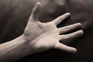
Description: This poster is to get people's attention about bullying. The tools I used in this project are: the rectangle marquee tool, brush tool, and text tool. I took a picture and brushed everything out of it besides the hand and i found a cloudy background and fit it to the canvas. I used two tutorials to help me with my final poster. The first tutorial I made included a halftone effect. I thought that I might use that in my final poster, but I found a different effect that interested me more. My second tutorial uses a sketch effect to make the image look some what sketched. I ended up using this effect for my final poster.

Tutorial 1:
http://www.theshockzone.com/tutorials/halftonedots.php
Description: I followed the steps in the tutorial but used a different image. The tutorial had 5 steps all together.

Tutorial 2: 
http://www.photoshopsupport.com/tutorials/or/high-contrast-sketch.html
Description: I followed all the steps in the tutorial and this was the final outcome. I used a different image then the tutorial showed. There were 7 steps all together.

Images used:
http://www.sxc.hu/photo/505602

http://www.everystockphoto.com/photo.php?imageId=262374&searchId=6c8d61508321ac444175370124200350&npos=14

http://webecoist.com/2009/12/22/spectacular-spectrums-10-amazing-rainbows/
Final Project:


Monday, April 18, 2011

Art Deco style poster

description of process: to make this art deco style travel poster, i first started off with finding a backdrop that had an ocean theme. I started to add things into it and blend it so it fit together. The hardest part of the project was making the mountains fit in with the poster idea. I spent the most time on blending the mountains in with the background. 
  • tutorials used: http://webexpedition18.com/work/design-a-vintage-style-swissair-travel-poster-in-photoshop/
  • http://kb2.adobe.com/cps/331/331327.html

images gathered to make final product: